Digitization brought massive opportunities, one of which includes the ability to do business with people from another country or continent- all the way to the opposite side of the world. Thus, companies have moved past traditional or local as most of the competition takes place in the online marketplace, which is no surprise; the world has become one global village.
In the face of this development, thousands of businesses, both large and small, move to get their online presence and compete in the digital space, as should you. There are enough customers to go around as long as your e-commerce business remains customer-centric.
So, how do you go about exploring the advantages these opportunities provide?
It’s simple; you create an e-commerce website. But before we go further, let’s take a look at what an e-commerce website is.
What Is an E-Commerce Website?
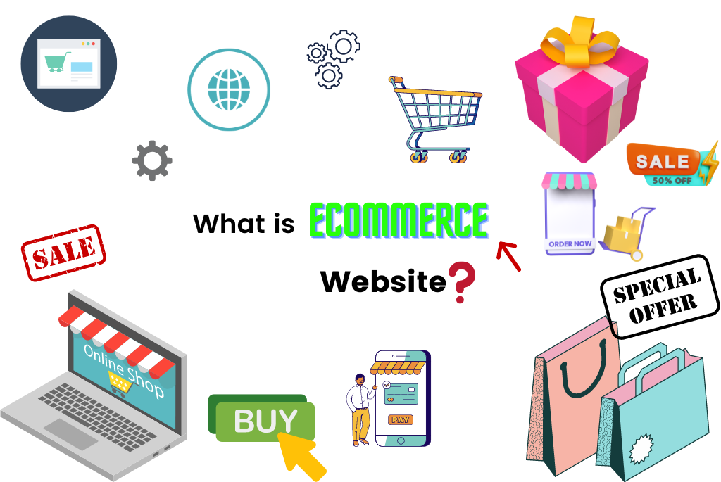
An e-commerce website is a website usually created with the intent of helping people buy and sell physical goods, digital goods, and services through the internet instead of going to a brick-and-mortar shop.
A business can use an e-commerce website to handle orders, receive payments, manage shipping and deliveries, and provide customer care. With an e-commerce website, you get exposure to potential new customers and more revenue.
How Do You Get One?
To start selling online, you have to build your e-commerce website. This usually takes a lot of research and planning, but thanks to the arrays of tutorials and resources, it’s become more accessible by the day.
You don’t need any coding or digital design experience. However, you must ensure that your online store is operational to make a profit.
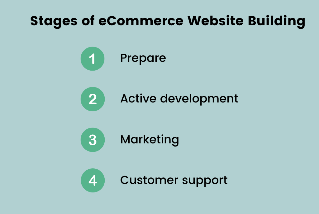
This article outlines the seven simple steps to creating an e-commerce site that sells for business owners. In addition, we’ve also included a list of tools that will help you get started on the right foot.
How To Build An Ecommerce Website
Select Your Preferred eCommerce Platform
The problem most new store owners face is usually selecting which eCommerce platform to build their business in because of the thousands of options available out there. Picking the right one, as a result, is challenging.
Here’s the thing, you want to select the one that is not only the best around but also the best for your business. As a result, many end up choosing the wrong ones or paying hefty consultation fees for help deciding which one to use.
To give you a general idea of what you should be looking for, let’s look at a couple of eCommerce platforms.
Shopify
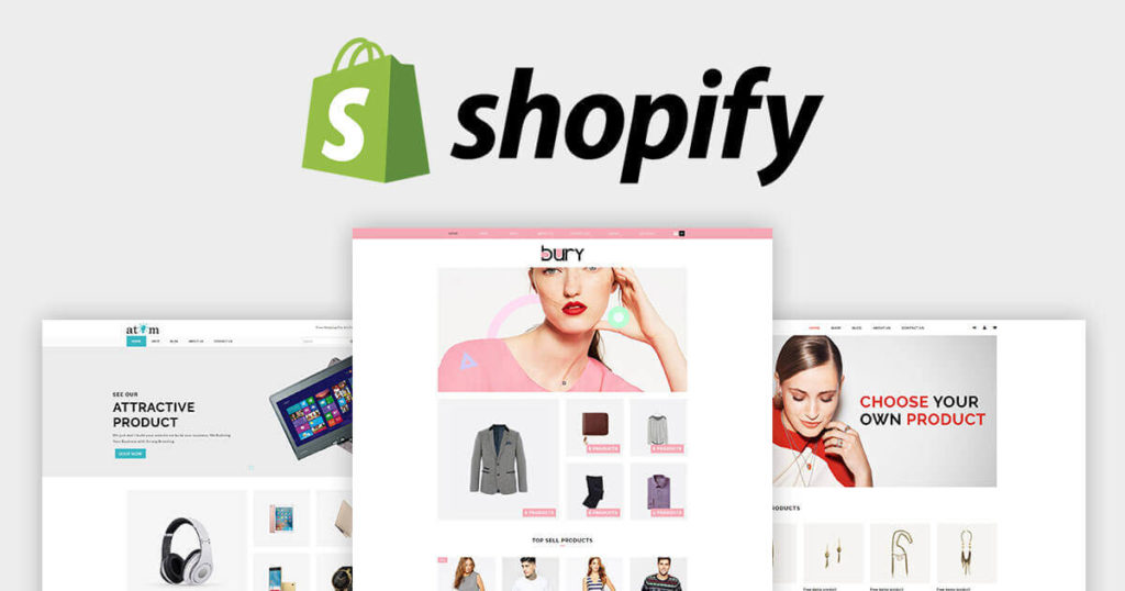
Shopify is one of the most trusted eCommerce platforms, powering over a million online stores. It’s an eCommerce platform that comes with everything you need to manage an online business, whether you have ten customers or a million.
Shopify offers a 14-day free trial and five pricing categories based on the size of your store. The pricing tiers per month include:
- Shopify Lite – $9
- Shopify Basic – $29
- Shopify – $79
- Advanced Shopify – $299
- Shopify Plus – $2,000
For more details on Shopify pricing and features, visit our Shopify reveiw page.
MORE: You can also use a design tool like Figma if you want to build a store from scratch. Check Figma pricing review.
Wix
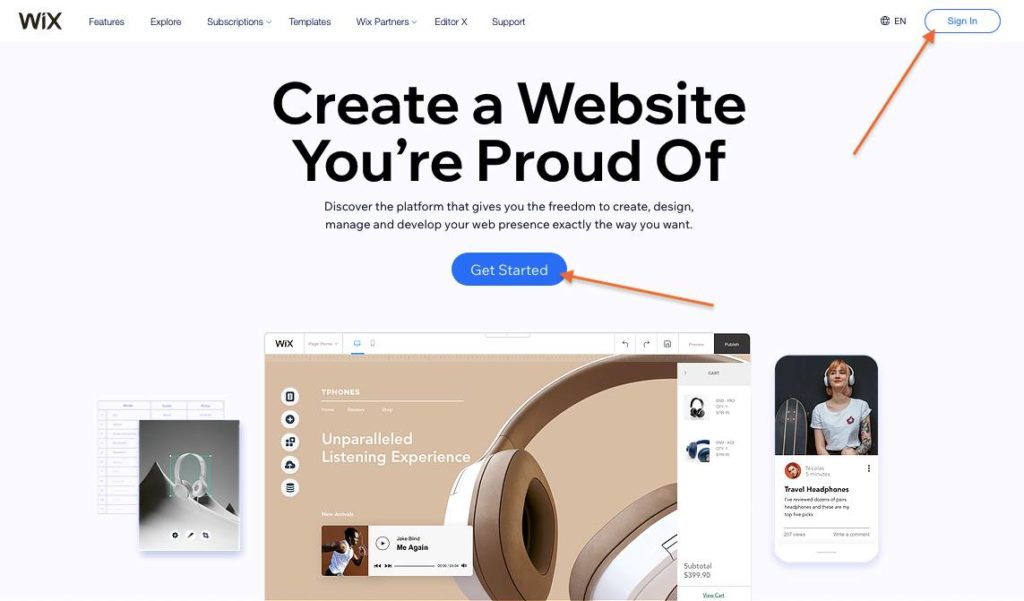
While Shopify is a tad expensive and on the high side for new store owners, Wix is a less expensive option. The website has helped millions of people to create their custom websites.
Wix is often suitable for small enterprises or business owners with a limited number of products.
On the other hand, Shopify is a better alternative if you want more tools and resources to help you grow your business.
Below are Wix’s less expensive price tiers:
- Basic – $23/month
- Unlimited – $27/month
- VIP – $49/month
Check out Wix’s review page to see the benefit of each plan and their features.
 Recommendation: Recommendation:If you’re looking for the best website builder software, visit our category page to see the most popular website builders on the market. Learn more about their features, pricing, and other details here. |
MORE: 21 free small business tools that every entrepreneur needs.
Select and Buy a Domain Name
A domain name is known as the URL of a web page. It is a crucial foundation factor of your online business because as physical business locations need an address, so do online stores. This is where your store domain name or URL comes in.
Your domain should ideally represent your company name and the products or services you offer. For example, if you sell crochet outfits, your domain name might be CatherineCrochetWears.com.
After you’ve come up with a few domain name ideas, check with a domain registrar to see whether it’s already taken. You can use one of the following domain registrars:
- Bluehost
- HostGator
- GoDaddy
If you find out that the domain name you want is already taken, you can try getting it in other domain extensions like .net or .co.
Domain extensions have no bearing on your search engine visibility; it’s all about how you want your customers to perceive your site. For example, you wouldn’t use.edu for eCommerce purposes as they clearly pass out what content they’re supposed to hold by simply reading them.
MORE: What is GoDaddy Airo and how it can help your business?
Choose a Hosting Provider
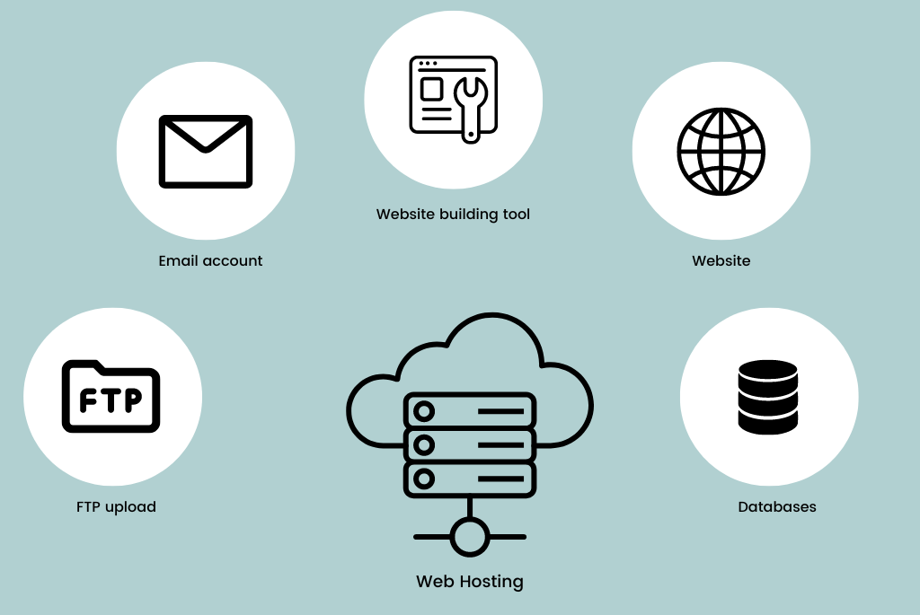
Now that you have selected a domain name, it’s time to decide who hosts your website using your domain name.
However, before you decide, you need to consider a number of things, including;
- If they support the eCommerce platform you have chosen, not all hostings do.
- What is their customer support like?
- Can you grow with them as a host as your market scales?
- How’s their speed?
- How security-wise are they?
- Can you register your domain name on their platform?
If the answers to these questions are favorable to you and your eCommerce store, then it’s time to proceed with the web hosting service provider.
| Recommendations: Check out the reviews of the best tools for web hosting in our best website hosting software category page and choose the one that suits your business. |
Build Your Online Store
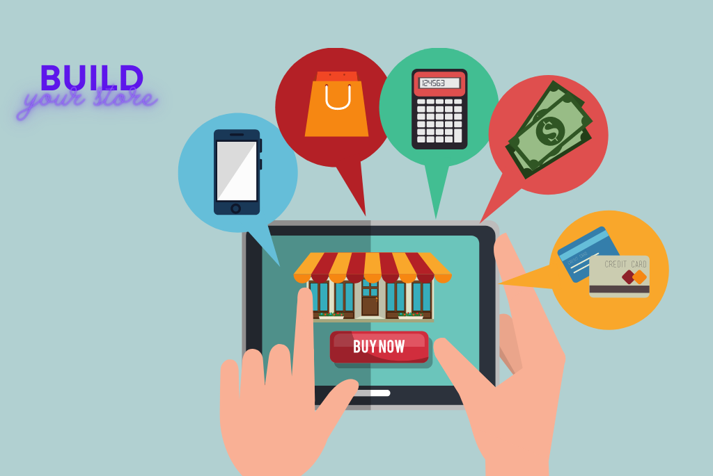
Building your website is usually specific to the platform you choose. However, the general phases you have to go through creating your online store to function include:
Design Your Store
Your online store must reflect your brand’s classic, elegant, or minimalistic identity.
Ecommerce platforms such as Shopify and Wix include hundreds of predesigned website designs. Use them as a starting point, and then modify them with your colors, wording, typography, and photos.
Using them will make a good start as they are known for their user-friendly interface. If you have trouble doing this or do not have the time for it, consider hiring a freelance designer to help you.
Web Pages
You must have four essential pages for your eCommerce because they include what online visitors look out for when they stumble on your page. The pages include:
- An about page, which gives information about your brand and why it exists.
- Shop or store page where customers browse the products you have for sale.
- A contact us page; a significant page for eCommerce stores that render services as products to customers.
- Frequently Asked Questions (FAQs) page for answers to questions website visitors might have.
Choose a theme that reflects your brand and allows you to highlight your products to their full potential.
Make categories that make sense to your customers. Learn everything about your target consumer and design your site around their preferences and ideal user experience.
Remember that your perception of your clients may differ from their perception of themselves, so create a mechanism to solicit their feedback as you develop your site.
Products Addition to Your Store
You will have a dashboard on your eCommerce platform where you can add products to display in your store.
Start with your primary product and get a couple in to get used to the interface before moving on to more sophisticated products.
Follow this checklist to keep organized and make your products as appealing as possible:
- Write detailed descriptions that follow SEO strategies, including the size, materials, and other details that purchasers require.
- Upload high-resolution product images or videos – consider hiring a professional photographer.
- Price your stuff reasonably. Look into similar brands to yours for an idea of pricing.
- Indicate how many products you have available on your dashboard to keep track of inventory levels.
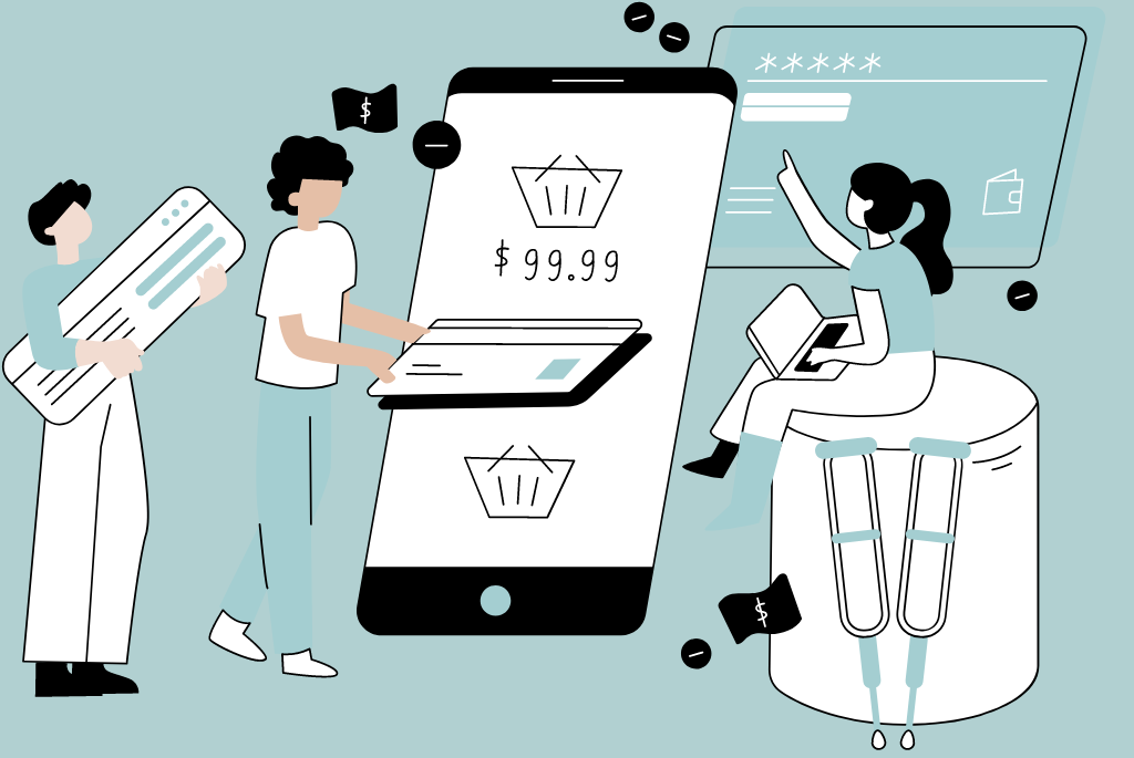
Payment Methods and Delivery
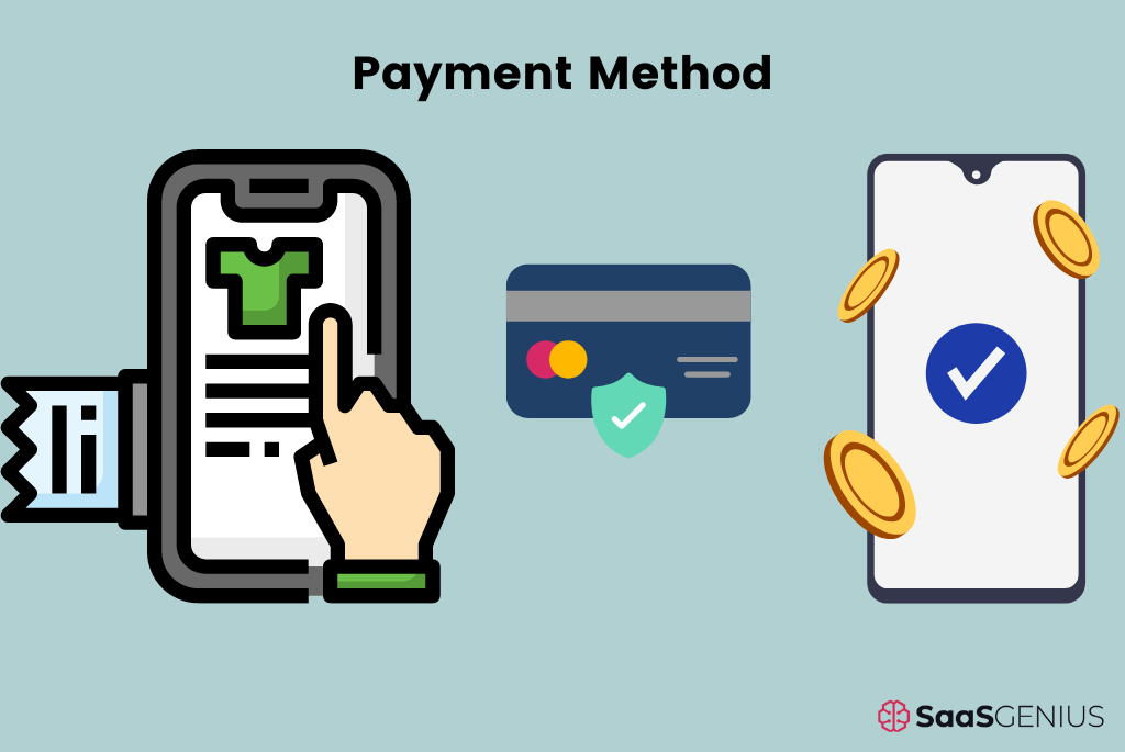
It’s time to give your customers a means to pay for your products once they’re on display.
The default processor of your eCommerce platform is the simplest way to accept payments online. You can do that for a start and move to select another processor when your website is running fully if you want other payment options and your eCommerce platform does not offer them.
After payment methods come shipment. Getting many orders is terrific, but manually producing mailing labels slows you down and can be costly. This is where shipping software comes into play.
Shopify has built-in shipping software that will let you automate packaging and shipment methods. However, other platforms like Wix require integrating a third-party shipping integration to get your goods to your customers.
Test-Run Your eCommerce Store
Test drive your eCommerce site for a test drive before going live to ensure you don’t run into any preventable troubles on launch day.
Here’s a pre-launch to-do list:
- Check all of your product information, including the prices and descriptions.
- Place a test order (Wix and Shopify feature test order capabilities, so you don’t have to spend real money).
- Check that all product photos have loaded.
- Ensure there is no broken link and that every link leads to the correct pages.
- Send a test message through your contact form.
- Have a friend evaluate your website; a fresh pair of eyes may see something you overlooked.
If everything seems good, then you are set to launch your website.
The next step is to organize your privacy settings. A privacy policy is an essential component of every website, eCommerce or not. WordPress will not allow you to go public unless you select a privacy policy page. Fortunately, a template is already in place, but you can also alter it or create your own.
Finally, ensure that all of your website’s must-haves—homepage, contact page, about page, and any additional content—are in place and look the way you want them to.
Finally, press the Launch Your Site button.
In Conclusion
Now that your website is up and running, you will need to grow your business by marketing your products. Create a marketing campaign to bring converting customers to your page, and create top-notch content to keep those converting customers coming.
Many vendors choose to sell on marketplace sites such as Amazon but struggle due to exorbitant fees and other restrictions.
To effectively market your product and grow your brand, ensure to use an eCommerce platform that offers the following:
- Built-in SEO optimization for every product.
- Using the most recent SEO tactics to help consumers find your eCommerce website, products, and services online
- Social media connection in one click
- Coupons or discounts to encourage repeat purchases
- Free email marketing software integration
| Recommendations: Don’t worry if you don’t know anything about SEO. There are numerous fantastic and simple-to-use tools on the market. Check out our best SEO software category page for more information. |
In addition, have a blog on your website where you tell website visitors about your product and offer resources. Remember that even if an advert gets them to your page, they will require the value you provide to stay—no better way to do that than in SEO-optimized blog posts.
Author

Adaline Lefe Mary John
Show all posts from Adaline Lefe Mary John
Methodology
- Who?
We are SaaS experts: Our specialists constantly seek the most relevant information to help support your SaaS business. - Why?
We are passionate about users accessing fair SaaS pricing: We offer up-to-date pricing data, reviews, new tools, blogs and research to help you make informed SaaS pricing decisions. - How?
With accurate information: Our website manager tests each software to add a Genius Score using our rating methodology to each product. Our editorial team fact-check every piece of content we publish, and we use first-hand testing, value metrics and leading market data.