Knowing what makes people click is essential for any online business, regardless of its size and field of expertise. Understanding your visitors means you can get on the same wavelength with them, which is ultimately the goal of most Internet marketers. A lot has been said about online persuasion, but how exactly can good design combined with web psychology maximize the potential of your website? Chances are you’ve already tried optimizing your website, but do you know why some things work better than others? Knowledge of universal psychological principles means you can tailor your communication to your target audience and increase your current conversion rate.
Web psychology
In 2011, Nathalie Nahai of the The Web Psychologist coined the term “web psychology”, which can be defined as “the empirical study of how online environments influence our attitudes and behaviours”. The science deals with universal tendencies and phenomena which occur because of how our brains are wired.
From the perspective of web psychology, there are a number of factors you should take into consideration when designing (or improving) your website. These include i.e. colour and image choices, trust cues, authority figures, formatting, and visual elements to name but a few. Bear in mind that individual differences, cultural differences, and the nature of your business mean that the examples presented cannot be treated as final, but rather serve as guidelines for introducing improvements which you can test (and yes, test absolutely EVERYTHING! You’d be surprised how small things can make the difference).
Related: Web psychology works best when combined with psychological pricing principles.
The elements of online persuasion
Some people are skeptical when they come across the phrase “online persuasion”, but it’s not necessarily a bad thing. If you have a good product or service you wish to sell and you truly believe your customers can benefit from using it, there’s absolutely nothing wrong with adjusting your message so that it is well-received and efficient. In the world of web psychology, INTENT differentiates between persuasion and manipulation.
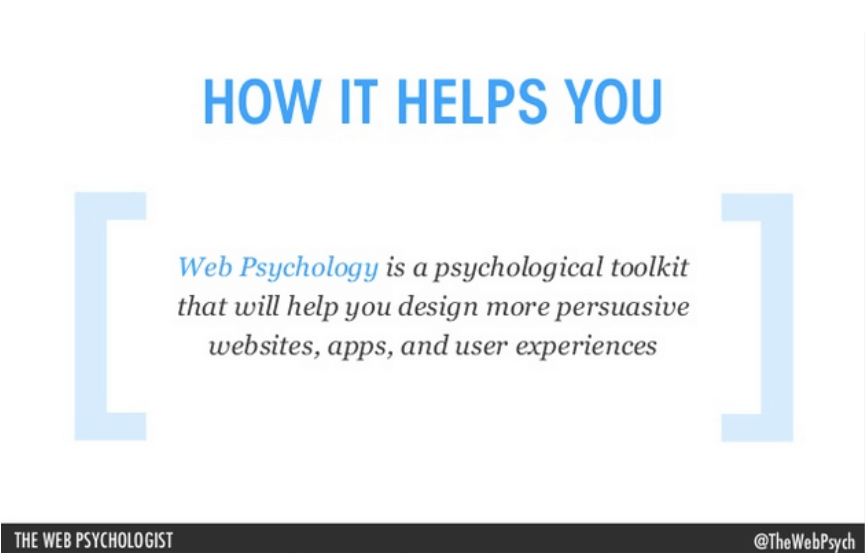
Being an online marketing specialist, you may think you are fairly immune to persuasive content, but is that true? We are so used to most of these elements we don’t see them as persuasive unless we focus on analyzing the website from that particular angle. Here’s a pop quiz from ScienceRockstars. How many elements of online persuasion can you spot?
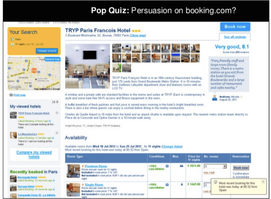
We all use online persuasion more or less consciously, but knowing some basic principles of web psychology can make all the difference.
Colours
You can’t really discuss colours without referring to colour psychology, which is a branch of behavioral psychology focusing on the effect of colours on human attitudes and behaviours. Colour psychology is extremely useful for online entrepreneurs, as every single detail on a website communicates a message to the customer. By choosing colours for your website, you decide which parts of your website you want the visitors to see first, which is a huge choice to make.
Colour equals emotion
Colours evoke fairly universal associations, they also correspond to various emotions. This correlation is depicted on Robert Plutchik’s Wheel of Emotions. Notice how tints and hues change the intensity of a given emotional state.
As an example, yellow can be associated with happiness and joy, which are one of main triggering emotions for sharing. Do your research when it comes to cultural differences regarding how colours are perceived in other countries. As an example, red is associated with love, lust, speed in Europe, but in Asian countries it symbolizes luck, prosperity, and marriage.
Colour vs identity
Some companies go as far as building their brand identity based on a particular colour. They aim at instant recognition based on colour cue itself. Here’s a great example – close your eyes and think of Cadbury’s chocolate bar. The first thing you’ll probably think of is their purple chocolate wrapper.
Colour is one of the first things you see when you open a website, so chose wisely. Colours are powerful means of communication as they evoke certain associations and emotions – as an example, purple or pink are often used in the cosmetics industry, as they are associated with luxury and they have a “lush” feeling to them. They work best when combined with prestige pricing to position your brand. Blue is by far the safest choice for many businesses (not only in the financial sector).
Website template
A lot of SaaS companies use a simple, minimalistic Apple-style website templates comprising white (or whitish) background, with a main colour theme. White is a crisp, fresh colour associated with purity and innovation, it also has a modern appeal to it. However, too much of a good thing can kill you – monochromatic websites with no (or very little) colour may offer too little stimulation. Most startups opt for blue and green website templates:
a) LiveChat – a lot of white spaces with red CTA buttons and a green chatbox stripe
b) SALESmanago – white + splashes of green
c) Blue seems to be the colour of choice for many SaaS websites, too. Perhaps it’s because blue is the favourite colour of majority of people (info here). Help Scout – blue as main colour + image of office workers.
d) Moz – spacious, minimalistic, with simple icons + a blue theme
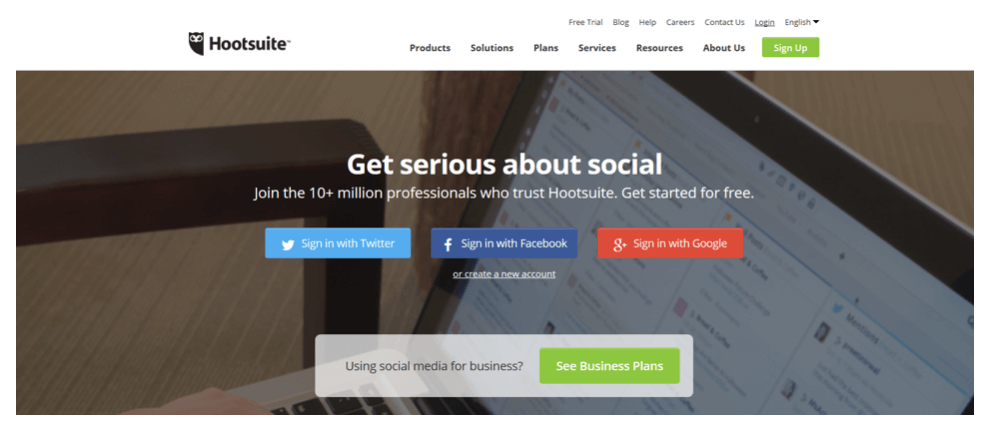
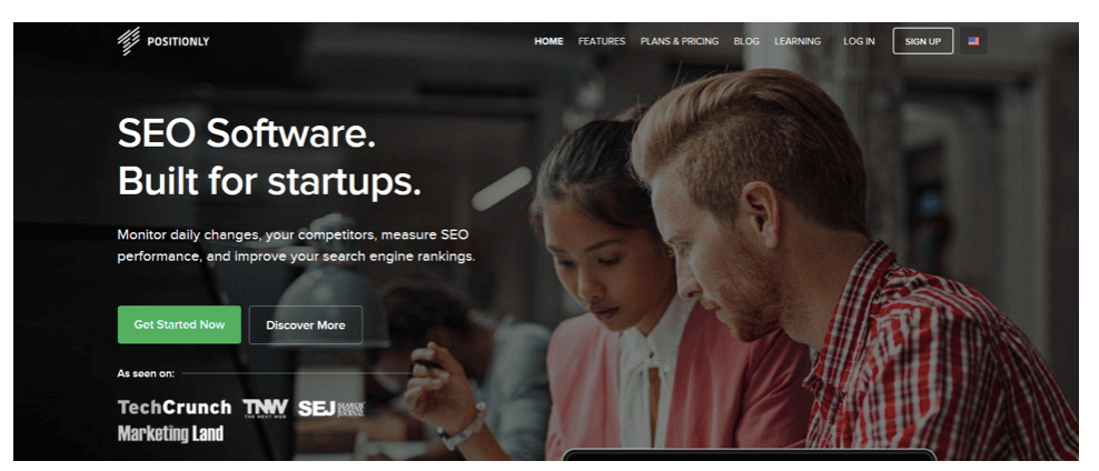
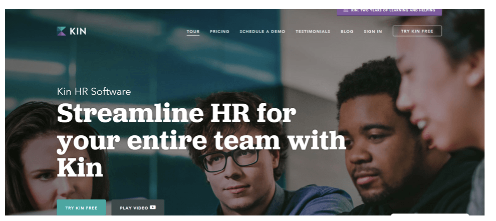
A lot of successful SaaS websites feature either work-related images such as offices, work surroundings, customers, employees, or devices (laptops and mobile devices) on their homepage:
a) GoToMeeting – image of a tablet
b) Hootsuite – laptop
c) Positionly – employees
d) Kin – employees, office surrounding, blue
e) MailChimp does it really well – their homepage background picture suggests a friendly workplace for the creative mind
Call to Action Buttons/ Conversion Elements
Bright colours that really stand out tend to perform very well here. These include:
a) Green
b) Blue
c) Yellow, orange – so called “ugly” colours, like yellow or orange often turn out to convert well.

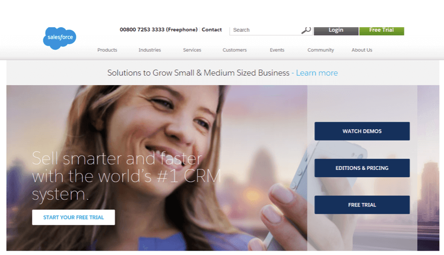
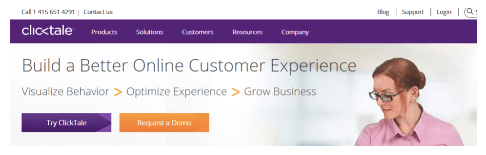
Colours are a great way to differentiate primary and secondary calls to action. Through contrast or selecting a much more visible colour, you can guide your visitor to perform the action you feel is more important:
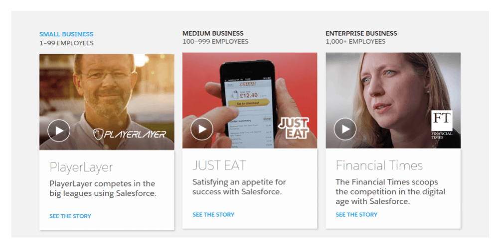
a) Salesforce – 3 different colours for CTA options
b) Clicktale
Images & video
We love images because of the way our brains function – not only do we respond better to visuals than to plain text, we also process visual information much faster and tend to retain it much better (approximately 80% of visual data we see is retained). What is more, we have mastered the art of scanning and skimming online content, and currently only read as little as 20% of text on a website.
We are also highly emotional when it comes to visual images – studies show that people react emotionally to cutting up pictures of their childhood possessions, even though they are fully aware pictures have no physical relationship with the actual objects (as opposed to cutting up photos of control objects).
The power of images in website design is immense – an image speaks volumes about your website, product or service. It can also say a lot about your audience or brand identity. One of the key things you should remember when designing websites that images you select should imitate your target audience and things they like or use on a daily basis. As an example, a lot of websites use pictures of people using laptops and mobile devices.
a) Salesforce – use of video in testimonials
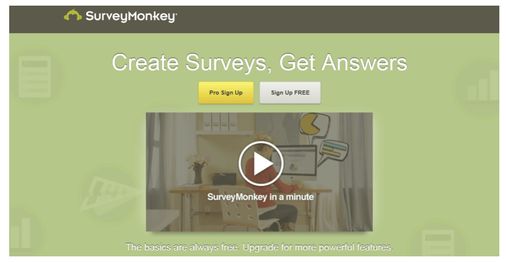
b) SurveyMonkey – use of video on the homepage helps outline the features of a complex product
Ticks
Another interesting thing is that Internet users tend to associate ticks with high performance, so it may be good idea to outline the features of your product or service in bullet points starting with a tick symbol. This is exactly what many successful SaaS companies are doing.
a) Hootsuite
Icons
Icons are a great way to convey meaning and prompt certain associations based on visual cues. SaaS businesses use these very often, as they get the message across without using up very valuable space on a website.
Keep your icons neat and simple to avoid confusion.
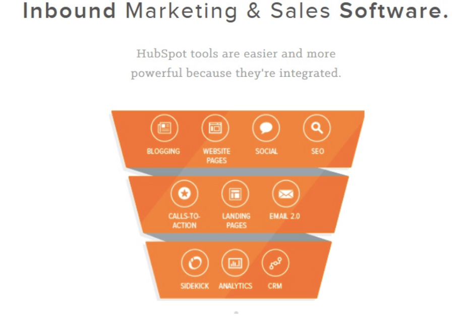
a) HubSpot – icons present multiple options
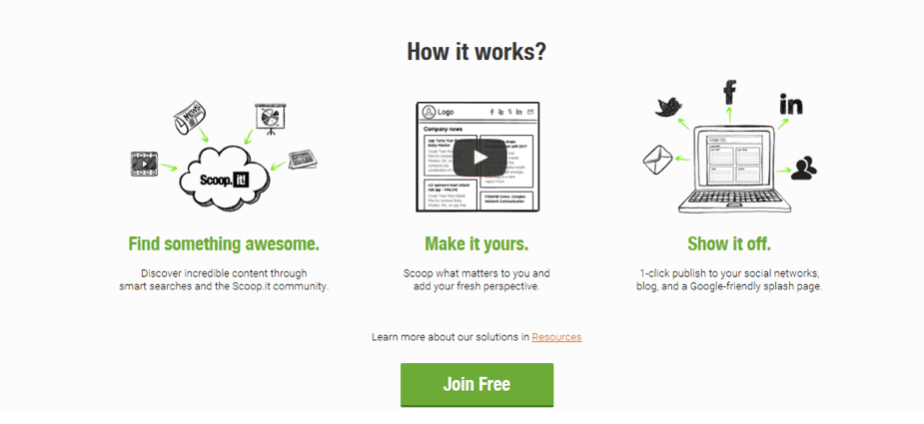
b) Scoop.it – icons illustrate the “how it works” section
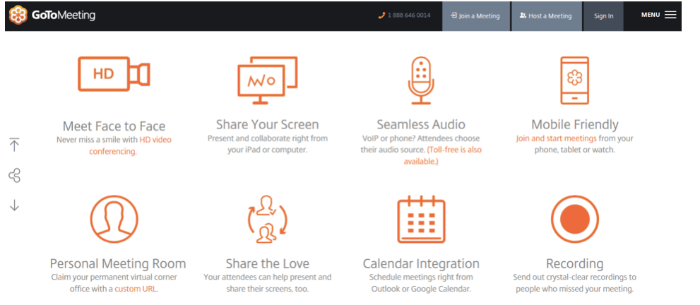
c) GoToMeeting – product features illustrated by means of icons
Symmetry & Continuity
Because of the way our brains are wired, we have an eye for symmetry. Experiments show that averageness and perfect symmetry of a face make it more attractive. We also tend to favour websites which have a simple, logical order (also achieved my means of symmetry). Have a look at the GoToMeeting icon screenshot – the icons are aligned in two symmetrical rows, which makes this section of a website look neat and organized.
It is important your visitors know intuitively that they should (or should not) scroll on your website. When designing, exercise caution as putting certain areas together may suggest all content is already visible. Make sure your most information is visible above the fold, and if there’s more, encourage scrolling by making part of what’s below the fold visible. Remember that you should ALWAYS present your value proposition above the fold.
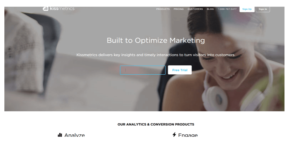
a) Kissmetrics
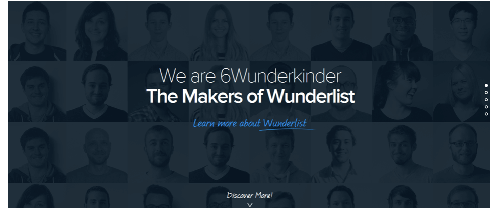
b) Wunderlist
The feminine side of SaaS, or Cialdini’s principle of liking
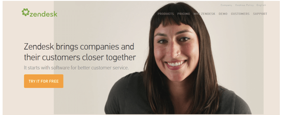
It seems that many SaaS companies choose an image of a smiling woman as their main image. The reason behind this is that we tend to comply with requests of people we like (Robert Cialdini).
a) Zendesk
This person’s appearance is all about customer service – she is very likeable and friendly, but doesn’t seem fake. The image seems to present a real person who you can trust. She doesn’t seem like a stock photo person, but rather an energetic customer service specialist who you can really talk to. Zendesk even included a video on their website presenting their Unique Selling Proposition (USP) , that is how close you can get to your customers based on their software. I am not totally convinced it is a good idea (check out the video yourself on their website), but it definitely differentiates them from other companies.
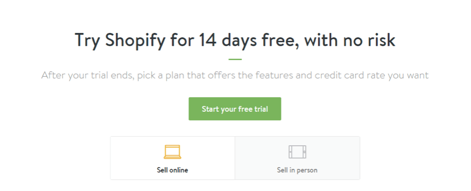
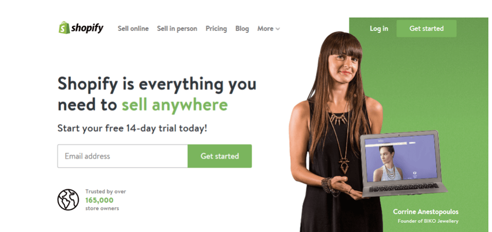
b) Shopify – image of a female customer holding a tablet
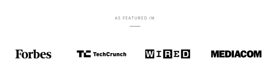
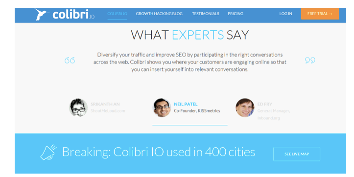
Trust cues
SaaS companies use trust cues in a number of ways, including padlocks, certificates, testimonials, and authority figures. They also present various data on their product, including number of users (preferably numbers of active users), mentions in universally recognized media, or partnerships.
a) Webpower – “as featured in” section
b) Colibri – authority figures used in testimonials
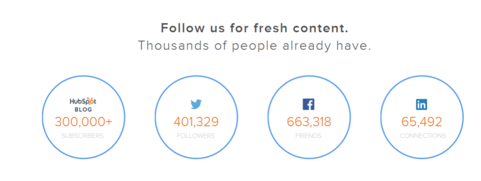
c) HubSpot – social proof in social media numbers
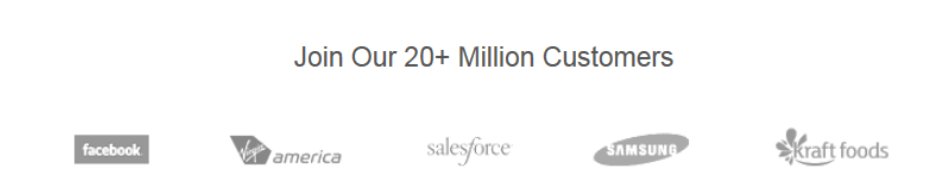
d) SurveyMonkey – social proof via numbers + renowned customers
…and things that violate trust
OK, so here’s a confession. One of our biggest mistakes when designing one of our first websites years and years back was to include an icon of a wallet with a dollar sign on it. The problem was that the website was directed at Great Britain. It is so basic, yet everyone nobody involved in the project noticed it as we operated internationally and used both pound and dollar symbols, so it didn’t look unnatural to us. For that reason, it may be a good idea to consult a specialist who is not involved in the project to take a look at it. If your marketing budget doesn’t allow for hiring a consultancy specialist, you can ask a friend or relative who is not a marketing specialist for their first impression of a website. You’d be amazed what you can find out.
The element of curiosity
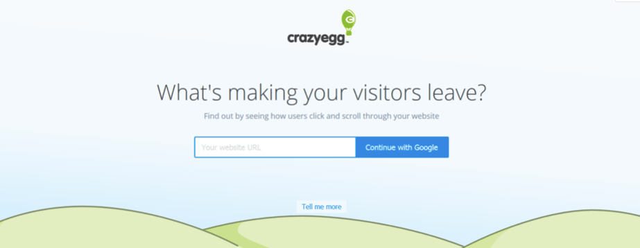
This is particularly interesting, yet very risky. If you are not a household name (such as Neil Patel of Kissmetrics and CrazyEgg), instilling a sense of secrecy can be risky in the SaaS world. However, if your company is already quite prominent, you can try this approach and see how you perform.
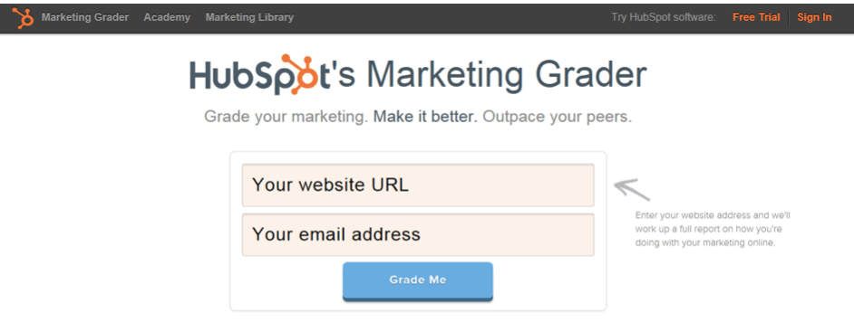
Free stuff, or Cialdini’s Reciprocity Principle
Giving out things for free makes people more eager to give something back to you in return. A lot of SaaS companies offer free graders, trials (also without credit card details), or free reports of their potential customers. An example:
Conclusion
Although there are no universal solutions when it comes to website design, knowing how our brains work can help us produce more efficient, user-centered solutions. Of course, there are limitations as certain factors vary cross-culturally, but the takeaway here is to analyze your audience and imitate their thinking process. What’s your experience when it comes to designing websites? Have you tried any of these techniques? What design solutions work best in your business? Have something to add? I’d love to hear your thoughts in the comment section below.
Author

Matija Kolaric
Show all posts from Matija Kolaric